Below are three different poster designs that I have created using Photoshop.
IDEA 1

This first poster idea is based on the idea we had about the saying 'there are two sides to the same coin'. It centres around the idea of not judging people until you've seen both sides of them, and we think it relates nicely to our storyline. To convey this in a straight-forward manner to the audience, I have added the saying as a tagline. I am not certain that the title of the film 'Jumping to Conclusions' quite fits with the rest of the poster design, but besides that, I am quite happy with this design.
How did I make this poster?

For this design, I used the 'Gaussian Blur' on the image that I used to blur it into the background because the edges were too sharp. I did this after removing the background of the image, and adjusting the colours to black and white. I thought that adjusting the colours would make the image more effective, as well as to blend with the background. I also used the 'Film Grain' filter to give the image an 'aged' effect.
This is the interface that I used to browse through different filters which I was able to easily apply to my image. There are quite a few to choose from, which means that I am able to manipulate my images or text to look the way I want it to.

I used the 'Graphic Pen' filter on the image to give it an authentic, old-fashioned look. I thought this would make the poster design look more striking because it is unusual and isn't used all that often in professional film posters.

For the title, I decided to use the 'spotlight' filter instead of adjusting the colours to black and white. This way the text was still legible against the dark two-tone background, but it also looks unusual and different.
IDEA 2

I think this second idea is definitely an improvement on the first idea. I used a motion blur and a Gaussian blur on the film title 'Jumping to Conclusions' in order to make it blend in with the rest of the poster. This is an improvement on the first design because I found a way to incorporate the title and improve the presentation so that the style is consistent. By making the title the only coloured feature of the poster, it makes it stand out more, and also pulls it away from the poster itself so that it gives the design some depth.
How did I make this poster?


I added this blue text because I wanted the title to stand out from the rest of the monotone colour scheme. I think on the finished product, the blue text looks more effective than if I had just left it black or white. I did play around with the position of the text on the poster, but I think it looks most effective as if the title is actually appearing on the mobile screen.
I also added the distribution logo because these usually appear on teaser trailers.


For the text, I had to make sure that it blended in to the image on the poster. I experimented by adding the 'Motion Blur' filter, and the 'Gaussian Blur' filter. After trying some of the other blur filters shown on the screenshot on the left, I decided that the first two I tried looked most effective.

This is the interface I used to change the colour of the text. It's a similar interface to the ones that can be found on common programmes such as Word, which is why I found it easy to use.

After trying different filters on the text, I applied the 'Film Grain' filter to my text because I liked the effect it gave on my previous poster design.

IDEA 3

I like this poster because the effects that I applied to the image of the swing work really well. I think that the title could be improved however, because the colours on the text were hard to match with each other. This is because I applied a lot of different filters onto the text, so it was hard to get the same effects on a second example of text.
How did I make this poster?

First I had to set up different layers in photoshop to create the different layers of my poster. The different components of my poster made up those layers, including the title, the tagline, the image, and the background. Once the layers had been created, I could begin to edit my poster and move things around until everything was in place.


These options on the toolbar meant that I was able to erase the background which was already a part of the image that I had chosen, and even replace the colour if I wanted to keep the background. I found that it looked better however with no background.
This box shows the different options that I used for my text. For this poster, I used the 'Vertical Type Tool' which allowed me to write vertically and make the text look different to the text I used in my other poster designs.


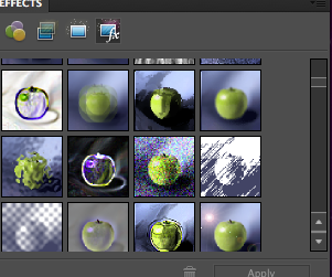
In order to edit my image, I had to resize and re-adjust its position, and then I was able to use different filters to give the image different effects. The screenshot on the left shows all the different filters that are available on Photoshop. For this particular image, I browsed through a lot of different effects such as blurring the photo, adjusting the colours to black and white, and changing the appearance of the image to a sketch effect. Above is the interface which I used to adjust the different levels and intensities of the filter I had chosen.
The screenshot on the left shows the effect that I chose for my text. I really liked the spotlight effect, and so adjusted the lighting accordingly. I had to play around with the intensity, the focus, and the position of the spotlight so that the text was visible against my background, but also so that the text looked professional.
I haven't really used Photoshop excessively before, but I found it surprisingly easy to use. After browsing through the different toolbars and menus, I found it easy to apply different filters and effects to the different parts of my posters.
No comments:
Post a Comment