Friday 14 December 2012

Character Poster


This is the character poster for one of the characters in our film. I have chosen to have the character in a long shot due to to the character being in the background of the film until the needed point so this poster shows the characters personality. Due to this being a character poster, i thought it would be appropriate to add to the title- "dont jump to conclusions" i decided to write this as it is something the character would say as she wouldn't want people to jump to conclusions about her just because of what she is wearing. 

Character posters

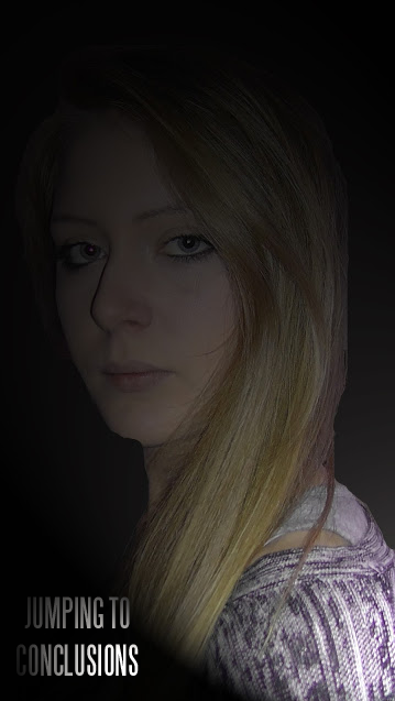
Here are some character photos that I have taken, and edited using Photoshop to turn them into character posters to go with our film posters and teaser posters. There will be a poster for each character, each with the same theme: there are two sides to every coin.

I edited the photos by erasing the backgrounds, and altering the lighting effects so that each character is partially shrouded in a spotlight. This idea supports the mysterious edge to our characters because it suggests that they are each capable of deception, and that maybe one of them - or all of them - have something to hide. It also means that before watching the film, the audience has no idea who is the culprit.

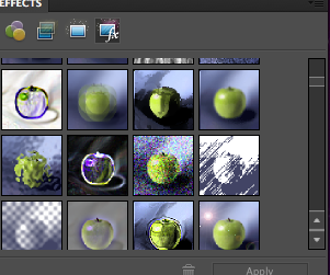
The first attempt at making these character posters allowed me to experiment with different effects which I could filter over the top of the image. After doing so, I found that I enjoyed adjusting the lighting on the photos, and decided to keep the same theme on all the character posters.

ORIGINAL PHOTOS


These are the original photographs that I took.
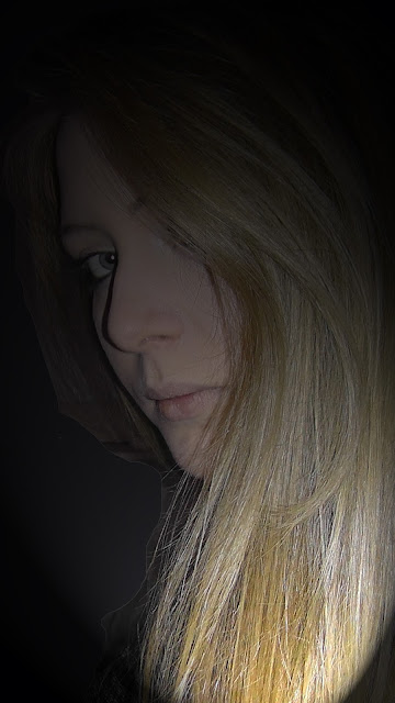
FIRST DRAFT


SECOND DRAFT (FINISHED POSTERS)


Thursday 13 December 2012

Audience feedback for Film Posters

After completing my teaser posters for our film, I posted the images on the social networking site Facebook in order to collect some audience feedback. We made sure to keep the request short, and to make the process as simple as we could for the audience, in the hope that more people would be willing to give us feedback.


After waiting a couple of days for people to get involved, we found that in total of the 7 people that replied, all of them preferred the first poster because it was clearer.


After receiving very little feedback on the Internet, we decided that we should try to approach the audience feedback in another way, and compare the results to see which method worked best. After discussing this, we decided that by printing out paper copies of the finished teaser posters, we could take them out into the streets and ask people to give us their opinions. 

Below is the sheet that we took out onto the streets for people to record their tallies. Our results from this research technique show that 13 people preferred the 2nd poster, whereas only 7 preferred the 1st poster, and 3 preferred the 3rd.


My Individual Teaser Poster Idea

We have decided to do a teaser poster as well as a teaser trailer for our film. We have done this because we feel it is important to grab our potential audience's attention as soon as possible before the film is released.
This is the step-by-step process of how i created our teaser poster, i struggled to use the programme PhotoShop so decided to use an internet programme called Editor by Pixlr to create it as i found it was simular to the PhotoShop software but i found it easier and simpler to use.


This is my final Teaser Poster.
The good thing about using this programme is that you can still can professional effects on the poster even though they have simpler tools and less effects. Everything was easily labeled and were what i was aware of where PhotoShop i didn't have any idea of how to use the programme. The main disadvantage of using this programme was the limited effects, for exmaple the text, although there were a variety of fonts, there were limited effects that i could use on the texts as compared to PhotoShop. If i had to do this poster again i would use a bigger picture to fill out the poster more and add more effects on the title as there is a large gap in the poster. I would try to add more of colour in the poster too.

Tuesday 11 December 2012

Film Poster Ideas

Below are three different poster designs that I have created using Photoshop.

IDEA 1


This first poster idea is based on the idea we had about the saying 'there are two sides to the same coin'. It centres around the idea of not judging people until you've seen both sides of them, and we think it relates nicely to our storyline. To convey this in a straight-forward manner to the audience, I have added the saying as a tagline. I am not certain that the title of the film 'Jumping to Conclusions' quite fits with the rest of the poster design, but besides that, I am quite happy with this design.

How did I make this poster?


For this design, I used the 'Gaussian Blur' on the image that I used to blur it into the background because the edges were too sharp. I did this after removing the background of the image, and adjusting the colours to black and white. I thought that adjusting the colours would make the image more effective, as well as to blend with the background. I also used the 'Film Grain' filter to give the image an 'aged' effect.


This is the interface that I used to browse through different filters which I was able to easily apply to my image. There are quite a few to choose from, which means that I am able to manipulate my images or text to look the way I want it to.

I used the 'Graphic Pen' filter on the image to give it an authentic, old-fashioned look. I thought this would make the poster design look more striking because it is unusual and isn't used all that often in professional film posters.


For the title, I decided to use the 'spotlight' filter instead of adjusting the colours to black and white. This way the text was still legible against the dark two-tone background, but it also looks unusual and different.


IDEA 2


I think this second idea is definitely an improvement on the first idea. I used a motion blur and a Gaussian blur on the film title 'Jumping to Conclusions' in order to make it blend in with the rest of the poster. This is an improvement on the first design because I found a way to incorporate the title and improve the presentation so that the style is consistent. By making the title the only coloured feature of the poster, it makes it stand out more, and also pulls it away from the poster itself so that it gives the design some depth.

How did I make this poster?


I added this blue text because I wanted the title to stand out from the rest of the monotone colour scheme. I think on the finished product, the blue text looks more effective than if I had just left it black or white. I did play around with the position of the text on the poster, but I think it looks most effective as if the title is actually appearing on the mobile screen.

I also added the distribution logo because these usually appear on teaser trailers. 
 This is the professional-looking text that always appears at the bottom of film posters. I downloaded and installed the font 'steel tongs' and used an actual film poster to write up the different cast and crew roles.


For the text, I had to make sure that it blended in to the image on the poster. I experimented by adding the 'Motion Blur' filter, and the 'Gaussian Blur' filter. After trying some of the other blur filters shown on the screenshot on the left, I decided that the first two I tried looked most effective.


This is the interface I used to change the colour of the text. It's a similar interface to the ones that can be found on common programmes such as Word, which is why I found it easy to use.


After trying different filters on the text, I applied the 'Film Grain' filter to my text because I liked the effect it gave on my previous poster design.
This is the interface I used to apply the filters on my image. I adjusted the charcoal area and the chalk area until I was happy with the finished effect.


IDEA 3


I like this poster because the effects that I applied to the image of the swing work really well. I think that the title could be improved however, because the colours on the text were hard to match with each other. This is because I applied a lot of different filters onto the text, so it was hard to get the same effects on a second example of text.

How did I make this poster?


First I had to set up different layers in photoshop to create the different layers of my poster. The different components of my poster made up those layers, including the title, the tagline, the image, and the background. Once the layers had been created, I could begin to edit my poster and move things around until everything was in place.


 These options on the toolbar meant that I was able to erase the background which was already a part of the image that I had chosen, and even replace the colour if I wanted to keep the background. I found that it looked better however with no background.


This box shows the different options that I used for my text. For this poster, I used the 'Vertical Type Tool' which allowed me to write vertically and make the text look different to the text I used in my other poster designs.


In order to edit my image, I had to resize and re-adjust its position, and then I was able to use different filters to give the image different effects. The screenshot on the left shows all the different filters that are available on Photoshop. For this particular image, I browsed through a lot of different effects such as blurring the photo, adjusting the colours to black and white, and changing the appearance of the image to a sketch effect. Above is the interface which I used to adjust the different levels and intensities of the filter I had chosen.


The screenshot on the left shows the effect that I chose for my text. I really liked the spotlight effect, and so adjusted the lighting accordingly. I had to play around with the intensity, the focus, and the position of the spotlight so that the text was visible against my background, but also so that the text looked professional.


I haven't really used Photoshop excessively before, but I found it surprisingly easy to use. After browsing through the different toolbars and menus, I found it easy to apply different filters and effects to the different parts of my posters.

'Steel Tongs' Font


'Steel tongs' is a font which is very similar to the fonts that are used on professional film posters. Below is a screenshot taken from a Harry Potter and the Deathly Hallows Part 1 film poster. It shows the text which is part of all film posters, and the text we will use on our own film poster.


This text always includes things like the writers, the producer, the cast, what the films might be based on, who wrote the scripts, who designed the costume, and who produced the film.


This is a screenshot of how I used the 'Steel Tongs' font to adapt the texts for our film. I included all the appropriate roles to finish with the end result which is captured in the screenshot below. I found Photoshop quite easy to use for text purposes.

The final product looks quite professional, and will be positioned at the bottom of our film poster to look authentic and professional.

Tuesday 4 December 2012

How are film posters made?


Below are a selection of film posters I have analysed in order to understand just how to compose a professional-looking film poster for our own film.


This film poster for the film Mirror Mirror is a new take on the original fairy tale of Snow White and the Seven Dwarfs. After looking at this film poster, it is really clear that film posters should make it clear what genre the film is, and what the general story is. They should be interesting and eye-catching, whilst including all the important information such as the release date, the name of the film, and perhaps information about whether or not the film will be viewable in IMAX or 3D.


This film poster focuses on the genre too by way of using the background image and a tagline intended to inform the audience of the general story. As opposed to the first poster for Mirror Mirror which focuses on the fairytale, fantasy aspect of the film, this one focuses on the character relationships and the war context of the story. Because this is a drama film, we can take inspiration from it because it is of the same genre of our film.


This film poster focuses more on the fantasy genre. Just from looking at this poster, the audience can ascertain that it might be mildly frightening from the expressions on the character's faces and that it will be set in exotic locations. Again because this is not just a drama genre, the poster is more likely to always focus on unique locations and the action.


This poster is again another we can draw inspiration from because it is the same genre as our film: a drama. Within that however, this film contains action and suspense which can be seen a little in this poster through the expressions of the characters and the fact that they are clinging to each other desperately. Just like the War Horse poster, this one focuses on the situation of the characters and their relationship.


http://www.sixsix8.com/2009/12/the-movie-poster-font-you-were-looking-for/ - this website shows the font of the text which is used at the bottom of film posters. It is called 'Steel Tongs' and is used by all film companies when they design film posters. This will allow us to make our poster look really authentic.


http://justcreative.com/2008/05/13/how-to-design-a-movie-poster-with-an-example/ - this link will take you to a website which clearly takes you through all the different stages of making a professional-quality film poster. They describe each stage of the process in detail and display the finished product at the end. They give tips on how to make the film poster a good-quality looking poster, and the website is available to anyone on the Internet.


Below is a screenshot of the bottom of a Harry Potter film poster. This will allow us to include all the important text needed for a professional-looking film poster.