These are some of my idea's for our production name along with the logo. One of them relates to media- the film strip and the other is a more simple idea. They are both big and bold which would stand out.
I like this design as it is girly but simple and would stand out and capture people's attention. I really like that it looks handwritten as we could edit it to look as though we have written it.
http://www.interactimage.com/
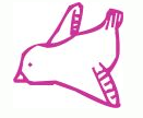
I think a bird swooping onto the screen would be a good idea to reveal our production name as this could also be our logo. I like the cartoon idea as they look hand-drawn, which is like our production name style of text. Although i would change the colour from pink to maybe black or blue.
Due to one of our members of our group leaving college, we now have to redo our Production name, Here are some ideas i have found from the same website. I have also introduced a production logo as we have not yet got one.


No comments:
Post a Comment